
Colour is something that is all around us but I don't think it's something that most of us pay attention. It's actually such a fundamentally important part of our lives and while we use it in the decor of our homes we can also use the theory behind it to help style our plants!

Most of us have seen the colour wheel. It's an elegant, if somewhat simplified, way to show the relationship between colours. Without going into an in depth history lesson the colour wheel came into being in the late 1600's and was actually developed by SIr Isaac Newton. He based it off of his experiments with light and prisms. These experiments led him to the epiphany that red, yellow and blue were the primary colours-aka the three colours from which all other colours are formed.
But why is this information useful?
Let me break down some different colour relationships and basic colour theory for you and how you can apply them to styling your plants! (If you'd rather watch a video on this I did make a video a while ago on my Youtube channel)
Primary Colours
In traditional color theory (used in paint and pigments) the primary colours are the 3 colours that cannot be mixed-red, yellow and blue. These colours (or hues) can be combined to make all other colours but you cannot make them.

Secondary Colours
Secondary colours are made by mixing different combinations of the three primary colours. The three secondary colours are green, orange and purple/violet.

Tertiary Colours
Tertiary colours are the inbetweeners-you get them when you mix a primary colours (blue, yellow or red) with a secondary colour (yellow, purple or orange): Yellow-orange, red-orange, red-purple, blue-purple, blue-green & yellow-green (or things like lime, plum if we're giving them more appealing names)

Tints, Tones and Shades
A tint is where white has been added (aka lightening up the colour, so pink is an example of a tint-white has been added to red)
A tone is where grey has been added (aka, taking some of the intensity of the colour out-the first example I can think of is a sagey green, a muted but still recognisable colour)
A shade is where black is added to a colour (aka making it darker-think something like navy blue)

Using blue as an example:


Tints Shades Tones
Now we have the basics, how do we use these colours together to create interesting colour schemes?
Complementary Colours
Complementary colours are any two colours which are directly opposite each other on the traditional colour wheel. They're as far from each other on the spectrum as possible which means when you put them next to each other they make each other pop (you're getting the visual equivalent of maximum contrast, the black and white of the colour world).
For example red and green, yellow and purple and blue and orange are complementary colours.


Analogous/Harmonious Colours
Analogous/harmonious colours sit next to one another on the colour wheel. It doesn't matter in which direction. Pick a colour and use the colour on either side and it will work!
Using a harmonious colour scheme creates a balanced and unified colour pallette as the colours are all related to each other but also different enough to pop!


Triadic Colours
Triadic Colours are equidistant apart from one another on the colour wheel. Use a triadic colour scheme if you're wanting something really dynamic with a lot of contrast that still feels balanced and thought out.

Warm and Cool Colours
Draw a line through the middle of the colour wheel and you'll get your warm and cool colours.
Your warms are anything in the reds, oranges and yellows
and your cools are anything with blues, greens and purples.

Tonal/Monochromatic Scheme
A tonal scheme or monochromatic scheme means you use just one colour but in varying tones/tints/shades. Think of those strips from the hardware store when you're picking a paint colour. If you only used colours from that one strip your colour scheme is going to be a bit bland as there's not much visual difference, it's basically the same colour just a bit lighter or darker.

All this is well and good but let's apply some of these to plants quickly. Imagine a monstera. Let's put it in some different pot colours using different colours schemes to see what happens.

The red pot would be using complementary colours-the red will make the leaves look more green and the green leaves will make the pot look more red.
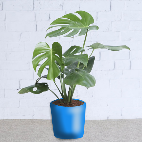
The blue pot is a cool colour scheme or a harmonious colour scheme. The green and blue are related enough to each other to have a gentle look but different enough from each other to complement and add a bit of visual interest.

This dark green pot makes use of a harmonious colour scheme/monochromatic colour scheme. It's a much more subtle look, where the plant blends in a bit with the pot. This would stand out less in a room and be a bit more of a subtle choice.
So there you have it! Colour theory 101 and a few examples of how you can apply it when styling your plants.
